Terraline is a startup dedicated to bringing to market the world’s most advanced, battery-electric, autonomous-ready, heavy truck, with a range exceeding 500 miles, massively reducing the environmental impact of freight transportation on our planet.
I was the brand director, creative lead, and project manager on this project while serving as the VP of Communications & Marketing. From the initial naming process through launch and beyond, I ensured the work provided by our in-house teams and contractors met the company's goals.

Radical Optimism
Grounded
Dignity & Respect
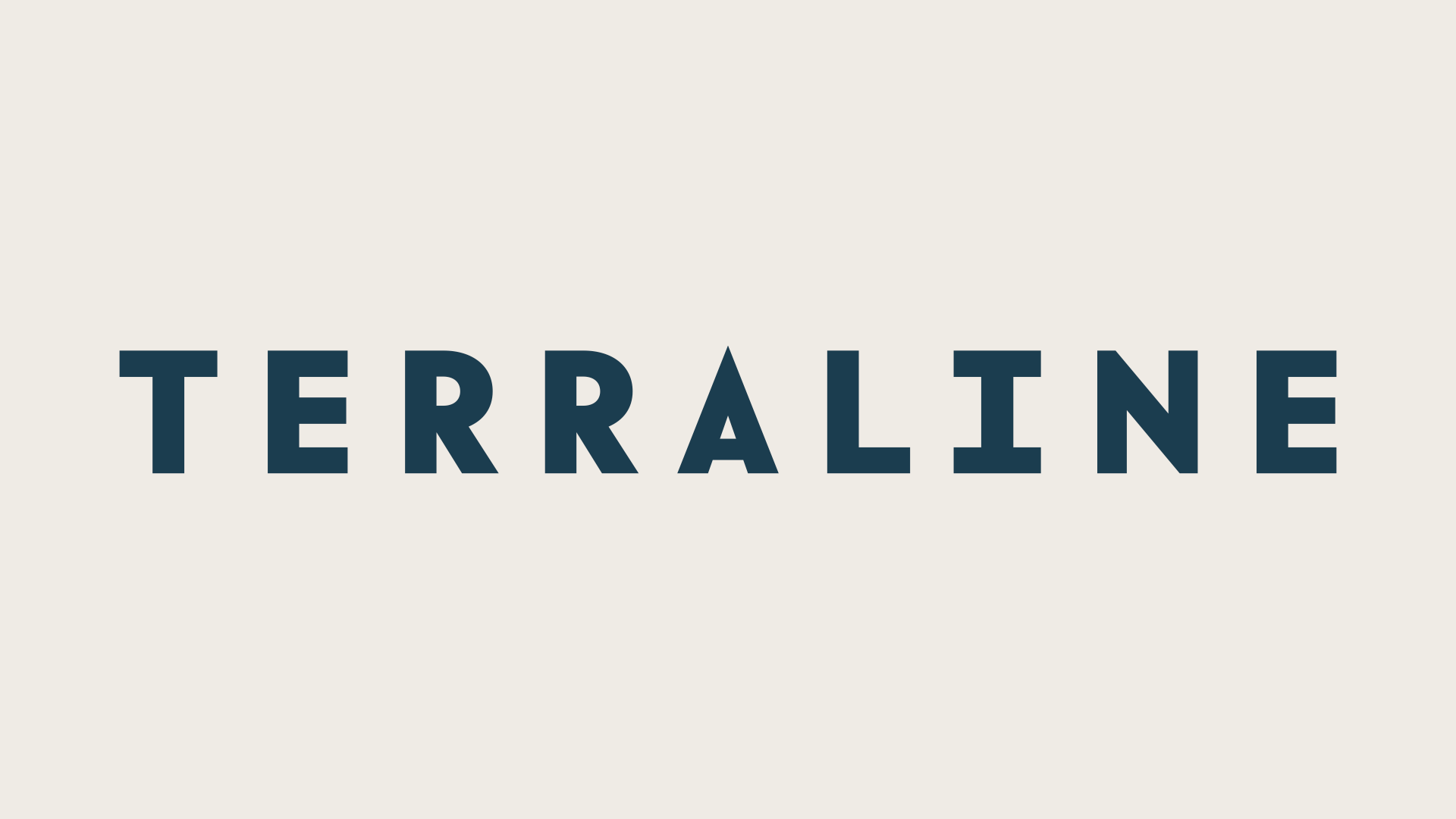
The name Terraline comes from a combination of "Terra," inspired by various sci-fi properties that showcase a united humanity, and "Line," a director of travel towards the future. The wordmark is designed to evoke a road, with the A mimicking both the vanishing point of a highway and the peak of a mountain.


Non-product brand photography emphasizes areal images of roads in strong environments like the woods or a snowy mountain. This imagery is meant to build on the "sense of place" aspects of the brand. The choice to go with predominantly areal photography comes from the use of topography patterns (seen below) as part of the brand package.
The primary pattern is a diamond-argyle one created from mirroring the shape of the A in the Terraline wordmark. The grid and directional lines on topography maps inspired the diamond-argyle pattern. The angle of the line from the left side of the A also serves as another element of the brand and is used on the side of the Tangra LH1, rendered below.

Tangra (pronounced “tan-gra”) is the platform name for Terraline's product line of trucks, and it, along with the "Long Haul 1" moniker (aka LH1), was developed through a series of internal brainstorming and ideation sessions. The name comes from a mountain range on the coastal islands of Antarctica. Mountains reflect the optimism of Terraline's mission and vision.


The brand includes assets that ground it in a "sense of place." Imagery is outdoors, focusing on roads and people in nature. Two patterns are pulled from topographical maps that can be used separately, or together. Primary colors of dark blue and warm cream are drawn from classic cars and earth tones to put distance from more colorful startup brands like Waymo.


Terraline's two primary colors are a rich navy blue drawn from classic sports cars balanced with a warm cream. Secondary colors include two greens, a light blue, alternate creams, and an accent of bring orange.